Available lang sa Ingles ang dokumentasyon ng produkto.
The form builder in depth
The form builder is where you design exactly what a form looks like and how it behaves. You drag elements onto a canvas, set their labels and options, add validation and visibility rules, and write the message respondents see after they submit. This page is a deep reference for every part of the builder. For a higher-level walkthrough of creating and publishing forms, see Building forms.
Before you begin
- You reach the builder by opening a form for editing. In the sidebar, click Forms, then open a form (or create one with New form) and open its builder. New to forms? Start with Building forms.
- Editing a form requires Update access for forms. Owners, Administrators, and Attorneys can edit forms. Staff can create and edit forms but cannot delete them. If your role does not include Update access, the builder opens in a read-only state: the palette is dimmed, and the Save button stays disabled.
- The builder is one screen with three panes: the palette on the left, the canvas in the middle, and the properties panel on the right. A toolbar runs across the top with the form name, Preview, and Save.
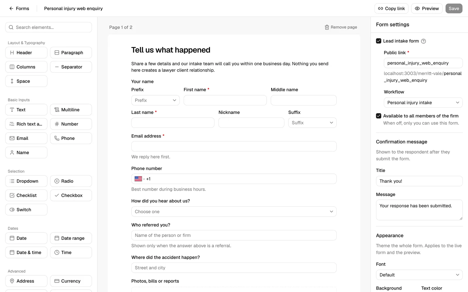
Important: The builder does not auto-save. Your changes are held until you click Save. The Save button is greyed out until you make a change, and shows Saving... while it works. If you navigate away with unsaved changes, those changes are lost.
Build a form with the drag-and-drop builder
You assemble a form by adding elements from the palette to the canvas. An element is a single building block: a question (like a text box or a dropdown), or a piece of layout (like a heading or a divider). Forms can have one page or several.
Add an element
The palette on the left lists every element you can add, grouped into sections. Use the Search elements... box at the top to filter the list by name.
The groups are:
- Layout & Typography - Header, Paragraph, Columns, Separator, Space.
- Basic Inputs - Text, Multiline, Rich text area, Number, Email, Phone, Name.
- Selection - Dropdown, Radio, Checklist, Checkbox, Switch.
- Dates - Date, Date range, Date & time, Time.
- Advanced - Address, Currency, Star rating, List, File upload, Practice area.
There are two ways to add an element:
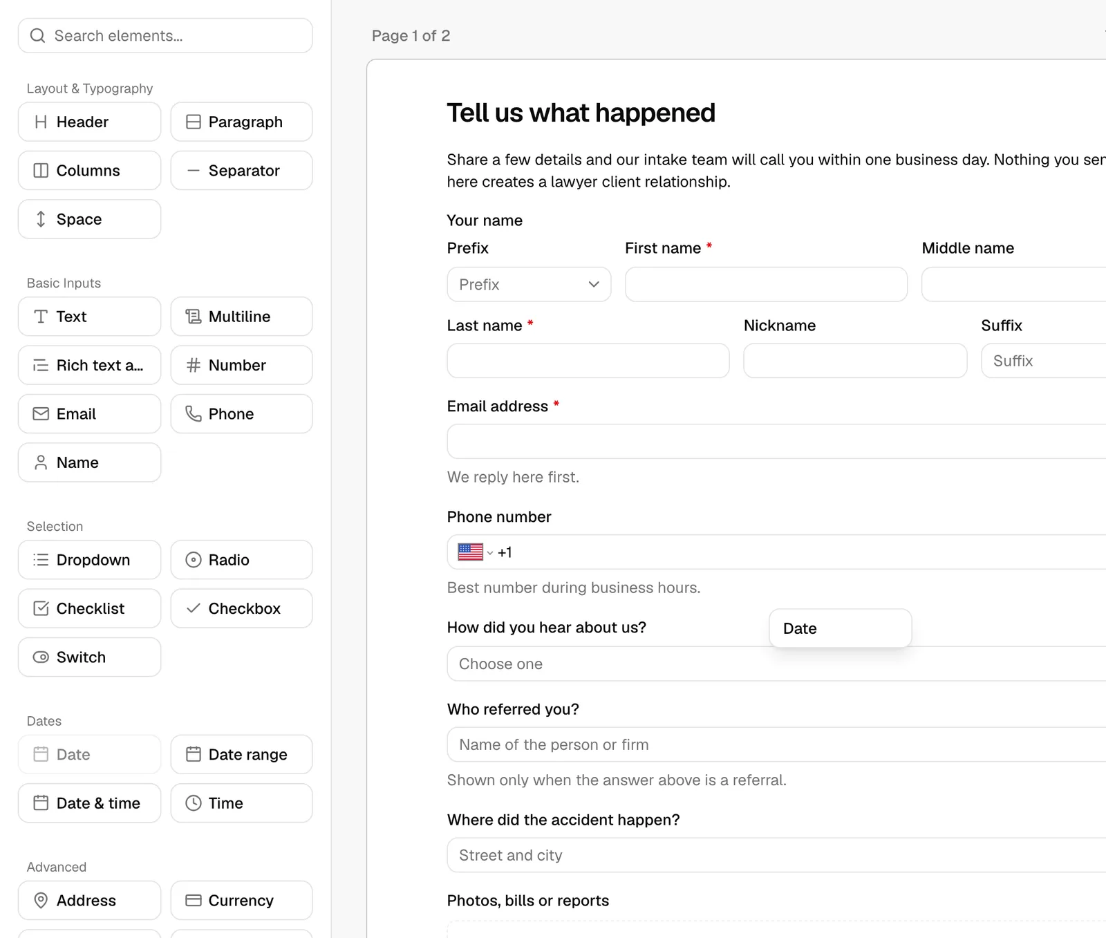
- Drag it. Press and hold an element in the palette, drag it onto the canvas, and release it where you want it. A drop indicator shows where it will land.
- Click it. Click an element in the palette to add it to the bottom of the current page.
When you add an element, it appears on the canvas as a live preview of the real control, and it is selected automatically so you can configure it in the properties panel.
Note: Phone and Address elements start on your firm's country, both on the canvas and in Preview, so the dial code and the address Country dropdown match the region your firm operates in. The person filling in the form can still pick any other country. See How your firm's country sets phone and address defaults.
Arrange and reorder elements
Every element on the canvas has handles that appear when you hover over it or select it:
- Hover over an element to reveal the drag handle (the grip icon) on its left and the remove (trash) icon on its right.
- Drag the grip handle up or down to reorder the element within its page.
- To move an element into a different page or into a column, drag it there and release.
- To delete an element, click the trash icon on its right. The element is removed immediately on the canvas (the deletion is committed when you next Save).
Tip: Click anywhere on an element to select it. The selected element is highlighted, and its settings open in the properties panel on the right. Click an empty area of the canvas to deselect and return the panel to the form-wide settings.
Work with pages
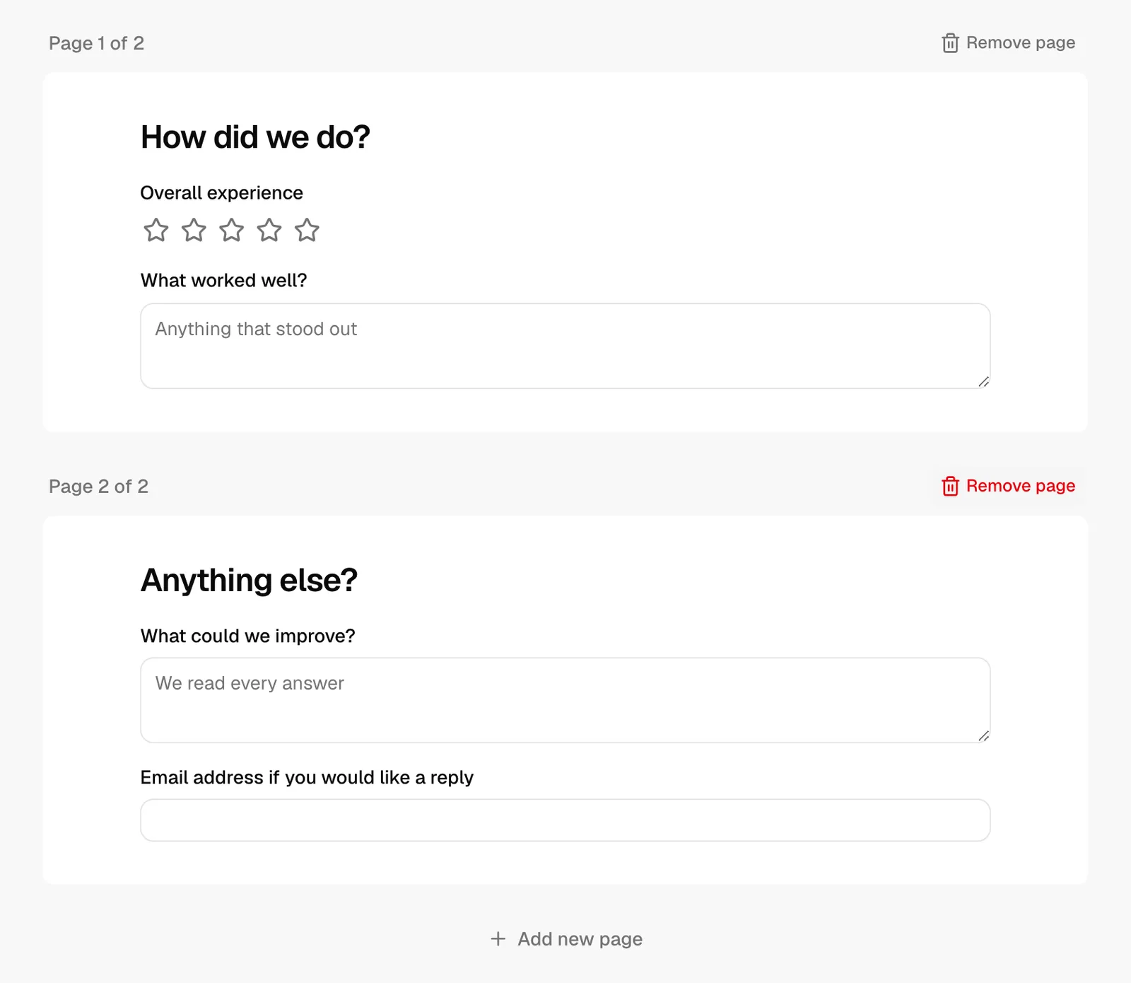
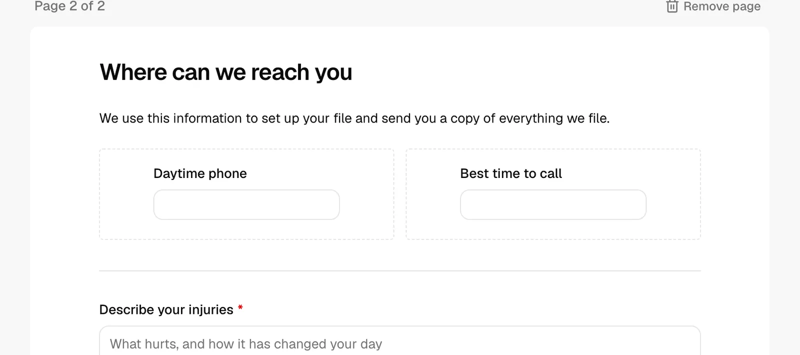
Longer forms can be split across pages. Each page is shown as a white card labeled Page 1 of N.
- To add a page, scroll to the bottom of the canvas and click Add new page. A new empty page appears.
- New elements you add by clicking the palette land on the page you are currently working in.
- To remove a page, click Remove page in that page's header. A confirmation dialog (Remove this page?) warns you that every element on the page will be removed. This cannot be undone.
Note: The Remove page button only appears when the form has more than one page. A form always keeps at least one page.
Configure an element's properties
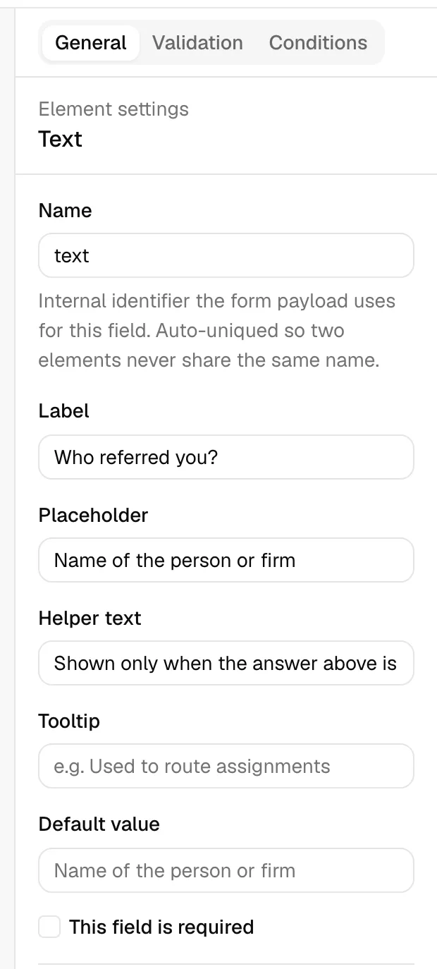
When you select an element, the properties panel on the right shows its settings under three tabs: General, Validation, and Conditions. The General tab is where you set the label, placeholder, helper text, default value, and whether the field is required.
The available settings depend on the element type. Here is what each setting does:
- Name - An internal identifier for the field. It is filled in automatically from the label and kept unique so no two fields share a name. You rarely need to change this. It is used behind the scenes to identify the answer and to match the field to a custom field (see "Use custom-field-backed elements" below). Only input fields have a Name.
- Label - The question text shown above the field, for example "Date of birth" or "Phone number". This is the most important setting on most elements.
- Placeholder - Light grey hint text shown inside an empty field, for example "Enter your department". Available on text-style fields and dropdowns.
- Helper text - A short line of guidance shown beneath the field, for example "Choose the team you belong to". Use it to clarify what you want without cluttering the label.
- Tooltip - Extra explanatory text that appears in a small information icon next to the label. Use it for longer notes that would crowd the helper text.
- Default value - A pre-filled answer the respondent sees when the form loads. It is rendered as a real control matching the field type, so you set it the same way a respondent would answer. Leave it blank for no default. Layout elements (Header, Paragraph, Columns, Separator, Space) do not collect an answer, so they have no default value.
- This field is required - When checked, the respondent must answer this field before they can submit. Required fields are marked with a red asterisk on the form.
Some element types add their own settings:
- Dropdown, Radio, Checklist - An Options list. Each option has a Label (what the respondent sees) and a Value (what is stored). The Value fills in from the Label automatically, but you can override it. Click Add option to add a row, and the trash icon to remove one.
- List - An Each line is setting that controls the type of each entry: Text, Number, or Multiline.
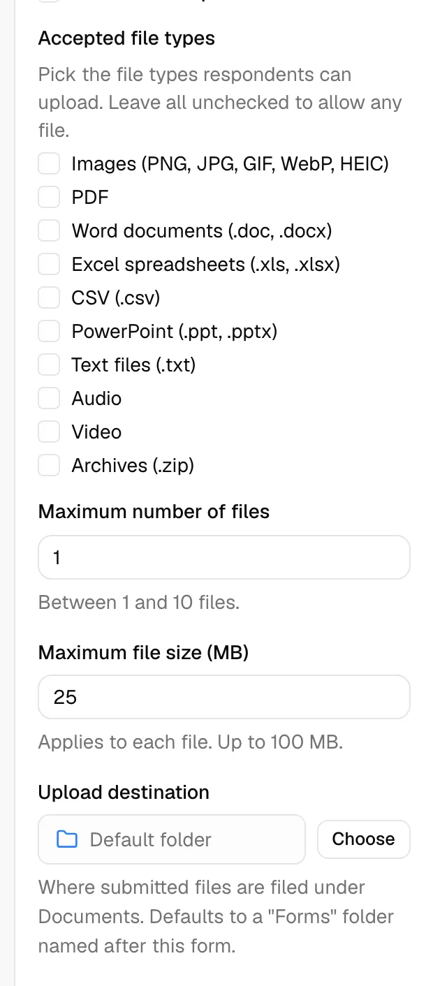
- File upload - Accepted file types, Maximum number of files (between 1 and 10), Maximum file size (MB) for each file, and an Upload destination folder under Documents. See "File upload settings" below.
Tip: For Dropdown, Radio, and Checklist fields, keep option labels short and clear. Respondents see the label, and your records store the value, so you can use a friendly label like "Personal injury" with a tidy value like "personal_injury".
File upload settings
The File upload element lets the person filling the form attach documents, for example an ID, a signed agreement, or a photo. Every file they attach is saved as a real document in your firm's Documents area, so you can open, download, move, and share it like anything else you keep there.
Select a File upload element on the canvas and set it up on the General tab:
- Give it a Label (for example "Upload your ID"), and optionally Helper text and a Tooltip to explain what you want. Tick This field is required if the form cannot be submitted without at least one file.
- Under Accepted file types, check the types you want to allow: Images (PNG, JPG, GIF, WebP, HEIC), PDF, Word documents (.doc, .docx), Excel spreadsheets (.xls, .xlsx), CSV (.csv), PowerPoint (.ppt, .pptx), Text files (.txt), Audio, Video, and Archives (.zip). Leave everything unchecked to allow any file.
- Set Maximum number of files between 1 and 10. This is how many files one person can attach to this question.
- Set Maximum file size (MB). It applies to each file individually, starts at 25 MB, and can go up to 100 MB.
- Set the Upload destination, the folder under Documents where the attached files are filed. It reads Default folder until you choose one:
- Click Choose. The Choose a folder dialog opens on your My documents folders. Click a folder to go inside it, use the breadcrumb trail at the top to step back out, then click Select this folder.
- You have to pick a folder rather than the top level. If you confirm while you are still at the root, a message asks you to pick a folder inside My documents instead.
- To go back to the default, click the trash icon next to the folder name. The field reads Default folder again.
- Click Save in the toolbar.
If you leave the destination on Default folder, Esqase files the attachments in a Forms folder at the top level of My documents, inside a subfolder named after this form. The Forms folder is created the first time it is needed and is visible to every member with document access, in the same way the Matters folder is.
Note: The Choose a folder browser shows the folders in your own My documents. A folder you pick from there may not appear at the top level of a colleague's list, so if several people review these submissions, leaving the destination on Default folder is the safer choice.
Tip: Keep Accepted file types and Maximum file size (MB) as tight as the question really needs. Clear limits stop clients sending a 90 MB video when you asked for a two-page PDF, and they see the limits written under the upload area before they choose a file.
For what the person filling the form sees while a file uploads, see How clients fill intake forms. For reading and downloading what they sent, see Reviewing form submissions.
Use layout elements
Layout elements shape and label your form without asking the respondent anything. They live in the Layout & Typography group.
- Header - A heading that introduces a section. In the properties panel you set the Heading text and choose a Heading size from H1 (Largest) down to H6 (Smallest). Use a Header to break a long form into clear sections like "About you" or "Your matter".
- Paragraph - A block of explanatory text. You type the Body text in the properties panel, for example "We use this information to set up your account." Use it to give instructions or context between questions.
- Columns - A side-by-side layout container. Set Column count to 2 columns or 3 columns. Each column shows a drop zone labeled Drag content here. Drag input or layout elements into a column to place fields next to each other (for example First name and Last name on one row).
- Separator - A thin horizontal divider line. Use it to visually separate sections. It has no settings.
- Space - A small vertical gap for breathing room between elements. It has no settings.
Note: Columns can hold other elements, but you cannot place a Columns element inside another column. Keep columns at the top level of a page.
Add field validation rules
Validation rules check that an answer meets a format, length, or value range before the form can be submitted. They live on the Validation tab of the properties panel and apply to input fields. Layout elements have no validation.
- Select an input element on the canvas.
- In the properties panel, click the Validation tab.
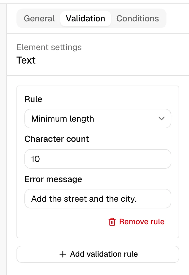
- Click Add validation rule. A rule card appears.
- Choose a rule in the Rule dropdown. The choices depend on the field type.
- For rules that need a value, fill in the value field that appears.
- Optionally enter an Error message to show the respondent when the rule fails. If you leave it blank, a standard message is used.
- To remove a rule, click Remove rule on its card.
The available rules are:
- Required - The field must be answered. (This is the same outcome as the This field is required checkbox on the General tab.)
- Minimum value / Maximum value - For number, currency, and star-rating fields. Enter a Numeric value the answer must be at or above, or at or below.
- Minimum length / Maximum length - For text-style fields (Text, Multiline, Rich text area, Email, Phone). Enter a Character count the answer must meet.
- Matches pattern - For text and number fields. Enter a Regular expression the answer must match. Use this for advanced format checks.
- Is a valid email - For text-style fields. Requires the answer to be a properly formatted email address.
- Is a valid URL - For text-style fields. Requires the answer to be a properly formatted web address.
Note: An Email field already checks for a properly formatted email address on its own, so a respondent cannot submit "not-an-address" even if you add no rules. Add your own Is a valid email or Matches pattern rule only when you want a custom error message or a stricter format; your rule then takes over from the built-in check.
Tip: You can add several rules to one field. For example, on an email field you might add Is a valid email and a Maximum length to keep entries tidy.
Add conditional visibility and required rules
Conditional rules let a field appear, disappear, become required, or become disabled depending on how the respondent answered another field. These live on the Conditions tab of the properties panel. Conditions apply to any element except a Columns container.
You configure a condition on the element you want to affect. For example, to show a "Company name" field only when someone selects "Business" earlier in the form, you put the rule on the Company name field and point it at the earlier choice.
- Select the element you want to control (the one that will be shown, hidden, required, or disabled).
- In the properties panel, click the Conditions tab.
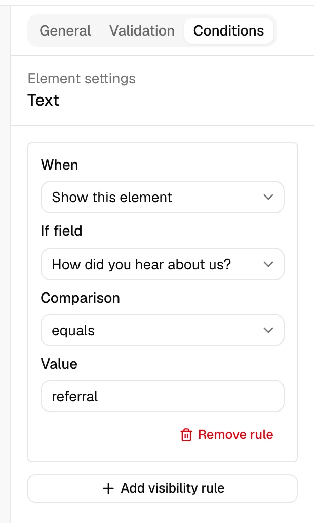
- Click Add visibility rule. A rule card appears.
- In the When dropdown, choose what should happen:
- Show this element - The element is hidden until the condition is met.
- Hide this element - The element is visible until the condition is met, then it disappears.
- Make this element required - The element becomes required only when the condition is met.
- Disable this element - The element becomes read-only when the condition is met.
- In the If field dropdown, choose the other field whose answer the rule watches. Only input fields appear here.
- In the Comparison dropdown, choose how to compare that field's answer:
- equals / does not equal - Matches (or does not match) a specific value.
- contains - The answer includes the text you enter.
- is empty / is not empty - The field has no answer, or has any answer. These need no value.
- is greater than / is less than - For numeric answers.
- If the comparison needs one, enter the Value to compare against.
- To remove a rule, click Remove rule on its card.
Note: You can only point a condition at a field that already exists on the form. If you have not added another input field yet, the Conditions tab tells you to add one first.
Tip: Conditional logic keeps forms short. Show advanced or follow-up questions only when they are relevant, so most respondents see a clean, simple form.
Style your form
Styling lets you change how a form looks so it matches your firm's brand. You can style a single element on its own, theme the whole form at once, or write your own CSS for fine control. Styles appear on the live published form and in Preview, and they have no effect on existing forms until you add them.
Style a single element
Per-element styles change the look of one element only, without affecting anything else on the form.
- Click an element on the canvas to select it.
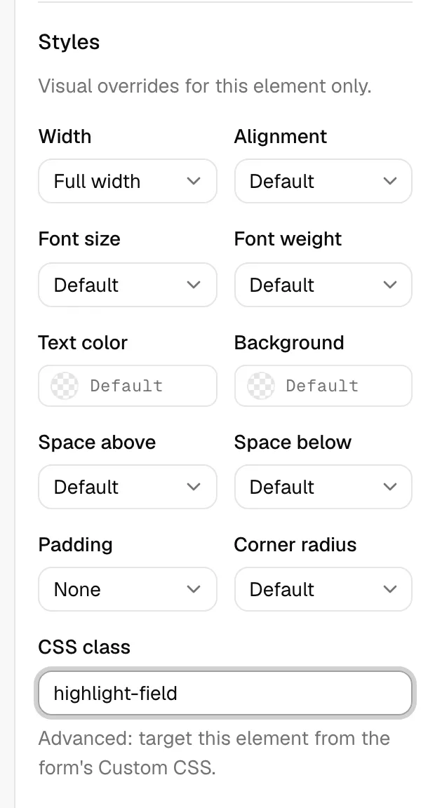
- In the properties panel, open the General tab and scroll to the Styles section. A note reads "Visual overrides for this element only."
- Adjust any of the settings below. Each one starts at the form's default, so a setting you leave alone keeps inheriting the theme.
- Click Save in the toolbar to keep your changes.
The element style settings are:
- Width - How wide the element is on its row: Full width, Half, or Third. Use this to place two or three elements side by side.
- Alignment - Aligns the content Left, Center, or Right.
- Font size - Small, Large, or Extra large, relative to the form's default size.
- Font weight - How heavy the text is: Normal, Medium, Semibold, or Bold.
- Text color - The color of the element's text. Pick a color, or clear it to fall back to the theme.
- Background - A background color for the element.
- Space above / Space below - Extra vertical room above or below the element, from None through Extra large.
- Padding - Inner spacing between the element's edge and its content: Small, Medium, or Large.
- Corner radius - How rounded the element's corners are, from None to Full.
- CSS class - An advanced field where you can give the element a class name (for example
highlight-field) so you can target it from the form's Custom CSS. See "Write custom CSS" below.
Note: Element styles are not available on the Columns layout element. To space or align the fields inside columns, style those fields individually.
Theme the whole form
Form-wide styling sets the look of the entire form in one place, so every element follows the same brand.
- Click an empty area of the canvas to deselect every element. The properties panel switches to Form settings.
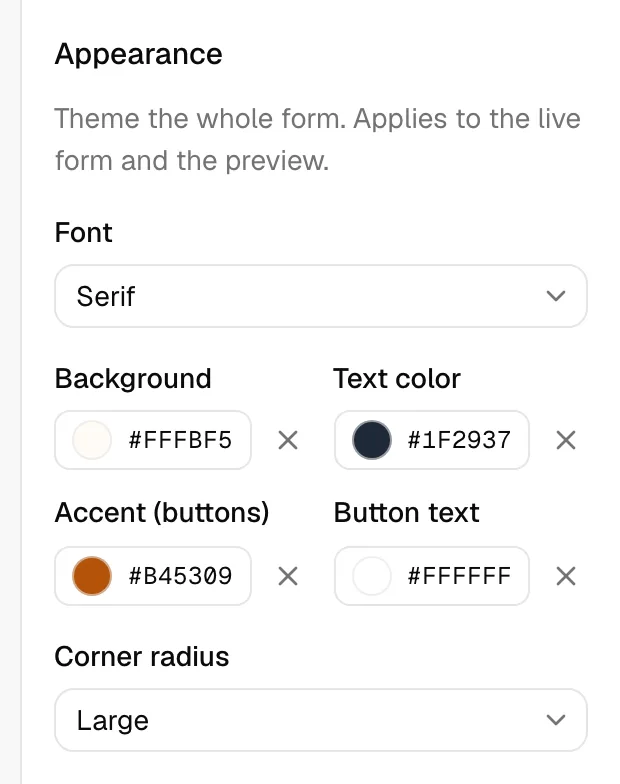
- Scroll to the Appearance section. The note reads "Theme the whole form. Applies to the live form and the preview."
- Set any of the options below.
- Click Save in the toolbar to keep your changes.
The appearance settings are:
- Font - The typeface for the whole form: System, Sans-serif, Serif, or Monospace.
- Background - The background color behind the form.
- Text color - The default color for all text on the form.
- Accent - The highlight color used for buttons and other emphasis.
- Button text - The text color shown on buttons, so labels stay readable against your accent color.
- Corner radius - How rounded corners are across the form, from None to Large.
Tip: Set your firm's colors here once, then only reach for per-element styles when a single field needs to stand out. A consistent theme looks more polished than many one-off overrides.
Write custom CSS
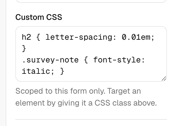
For advanced styling beyond the built-in options, the Appearance section includes a Custom CSS box where you can write your own CSS.
- In Form settings, scroll to the Appearance section and find the Custom CSS box.
- Type your CSS rules. To target a specific element, first give that element a CSS class in its own Styles section (see "Style a single element"), then use that class name in your rules here.
- Click Save in the toolbar.
A few things to know:
- It only affects this form. Your CSS is automatically scoped so it cannot change any other form or any other part of Esqase.
- Unsafe rules are removed. For security, rules that reach outside the form (such as external web addresses, imports, and scripts) are stripped out automatically before the styles are applied.
- Use the CSS class field to target an element. This is the reliable way to point a rule at one specific element on the form.
Note: On very old browsers, Custom CSS may not apply. When that happens the form simply appears unstyled, and it still works normally so respondents can complete and submit it.
Use custom-field-backed elements
Custom fields are the extra data fields your firm defines to capture information beyond the built-in details, such as a referral source or a case-specific value. You can read more in Custom fields. Forms connect to custom fields in two places: through each field's internal Name, and when you convert a submission.
- The Name links a form field to a custom field. Every input element has a Name on its General tab, filled in automatically from its label. When a form answer is later routed to a lead or matter, Esqase matches the form field to one of your custom fields by this Name (and by the field type). Keeping the Name aligned with an existing custom field's name lets answers flow straight into that custom field.
- Convert a submission's answers into custom fields. When you review a completed submission, you can choose Convert to custom fields. This takes the answers that do not already match a built-in detail and creates or fills the matching custom fields for you, so the data lands in a reusable place. File upload answers are the exception: they cannot become custom fields.
Note: Static and layout elements (Header, Paragraph, Columns) and File upload fields are skipped when a submission is routed into a lead. Attached files are not lost, they are filed under Documents instead, because a file is not a custom field value.
Tip: If you already have a custom field you want a form to feed, give the matching form element the same Name so answers connect automatically. See Field sets and using custom fields for how custom fields are grouped and reused.
For how submissions are reviewed and converted, see Reviewing form submissions.
Configure the submitted / thank-you page
After a respondent submits the form, they see a confirmation page. You control its wording in the form-wide settings, not on any single element.
- Click an empty area of the canvas to deselect every element. The properties panel switches to Form settings.
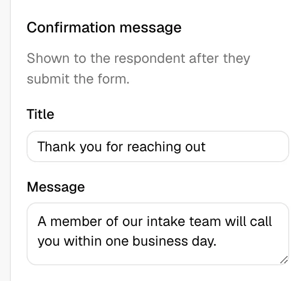
- Scroll to the Confirmation message section. The note explains this is "Shown to the respondent after they submit the form."
- In Title, enter the heading for the confirmation page, for example "Thank you" or "We have received your form".
- In Message, enter the supporting text, for example "Our team will review your information and reach out within two business days." This field accepts a longer paragraph.
- Click Save in the toolbar to keep your changes.
Tip: Keep the confirmation message warm and specific. Tell the respondent what happens next and roughly when they will hear from you. This sets expectations and reduces follow-up emails.
The Form settings view also holds form-wide options you may want to set here:
- Lead intake form - When checked, every submission creates a lead and a contact, and the form gets a reusable Public link. A Name field and an Email or Phone field are required. You can also attach a Workflow that is added to each new lead. See Public lead-intake forms and Assigning and attaching workflows.
- Available to all members of the firm - When checked, every member can use this form. When off, only you can use it.
Preview and save
Before you publish, preview the form to see exactly what a respondent sees.
- Click Save in the top toolbar to commit your changes. Save is disabled until you have an unsaved change, and shows Saving... while it works.
- Click Preview to open the form in a new tab, rendered read-only the way a respondent would see it.
Important: Preview reflects the last saved version. If you have unsaved changes, the Preview button is disabled and a tooltip reads "Save your changes to preview." Save first, then preview.
Common questions
Why is the Save button greyed out? Either you have no unsaved changes, or your role does not include Update access for forms. If the whole builder is dimmed and the palette will not respond, you have view-only access.
Why can I not preview? You have unsaved changes. Click Save, then Preview.
My condition does not list the field I want. Why? Conditions can only watch input fields, and only fields that already exist on the form. Add the field you want to watch first, then set the condition.
Does removing a page delete its questions? Yes. Removing a page removes every element on it, and that cannot be undone. Move any elements you want to keep to another page first.